a semi-correct windows screenshot identification guide
... i got nerdsniped into doing this, of course
someone in a discord server i’m in asked the question “how do you tell windows versions apart by looking at them?” - and thus, i had to put this together.
this is not meant to be exhaustive (i’m not even going to try documenting betas…), and doesn’t include server editions, but. here you go, nonetheless.
contents
release-by-release
let’s start at the top - by which i mean, the bottom, because windows 11 sucks.
Windows 11
|
|
|
| My Computer | Show Desktop |
|---|
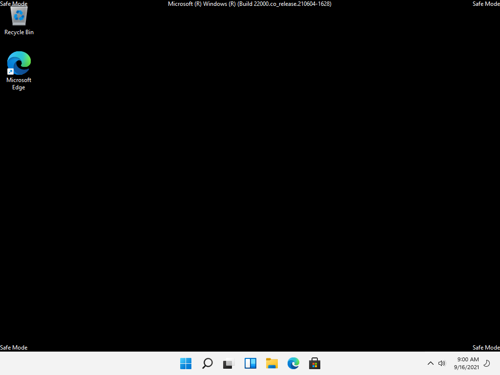
this one’s pretty easy - the Windows logo on the Start button is a four-panel square. the taskbar is centre-aligned by default on Windows 11, but there’s an option in the taskbar settings to move it to the left.
Windows 10
|
|
|
| My Computer | Show Desktop |
|---|
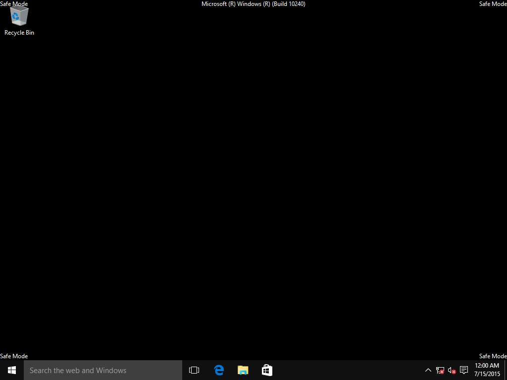
Windows logo is a four-panel trapezoid (Microsoft say it’s a “flag shape” but that’s bullshit).
the Action Centre icon in the notification area (looks kinda like a speech bubble - between the clock and the volume control in the above screenshot) can also be a giveaway - this can be disabled, but it almost never is.
Windows 8 / 8.1
|
|
|
| My Computer | Show Desktop |
|---|
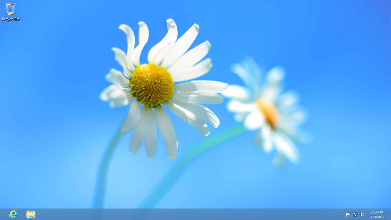
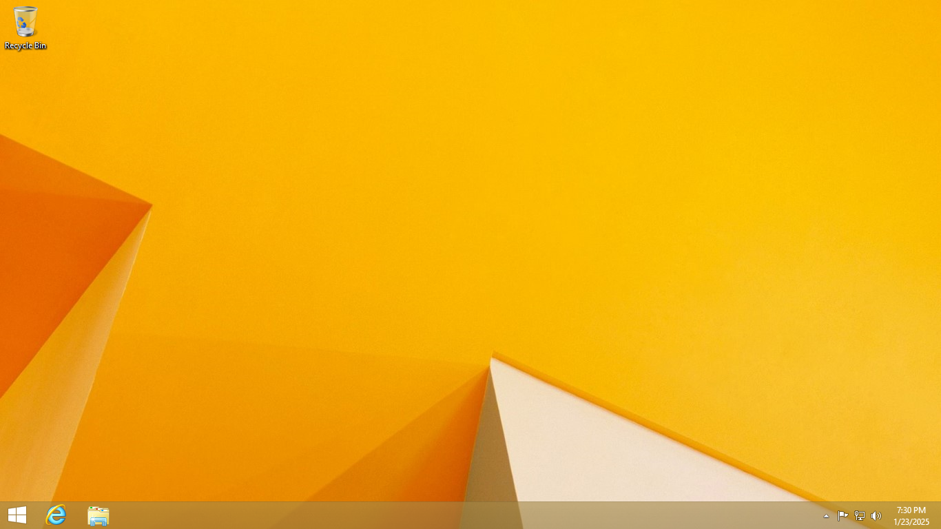
if there’s no Start button on the left-hand side, it’s Windows 8. the Start button was re-added in Windows 8.1, because everyone hated the removal of it. the Windows logo here is the same style as in Windows 10, but it’s much larger in size in the taskbar.
the notification area icons are a similar “flat outline” style to Windows 10, but the outlines are much thicker.
see also: Start screen differences between Windows 8 and 8.1
Windows 7
|
|
|
| My Computer | Show Desktop |
|---|
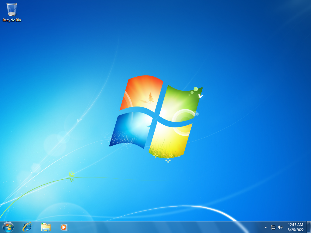
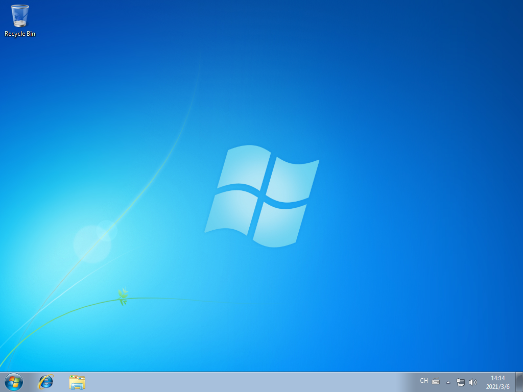
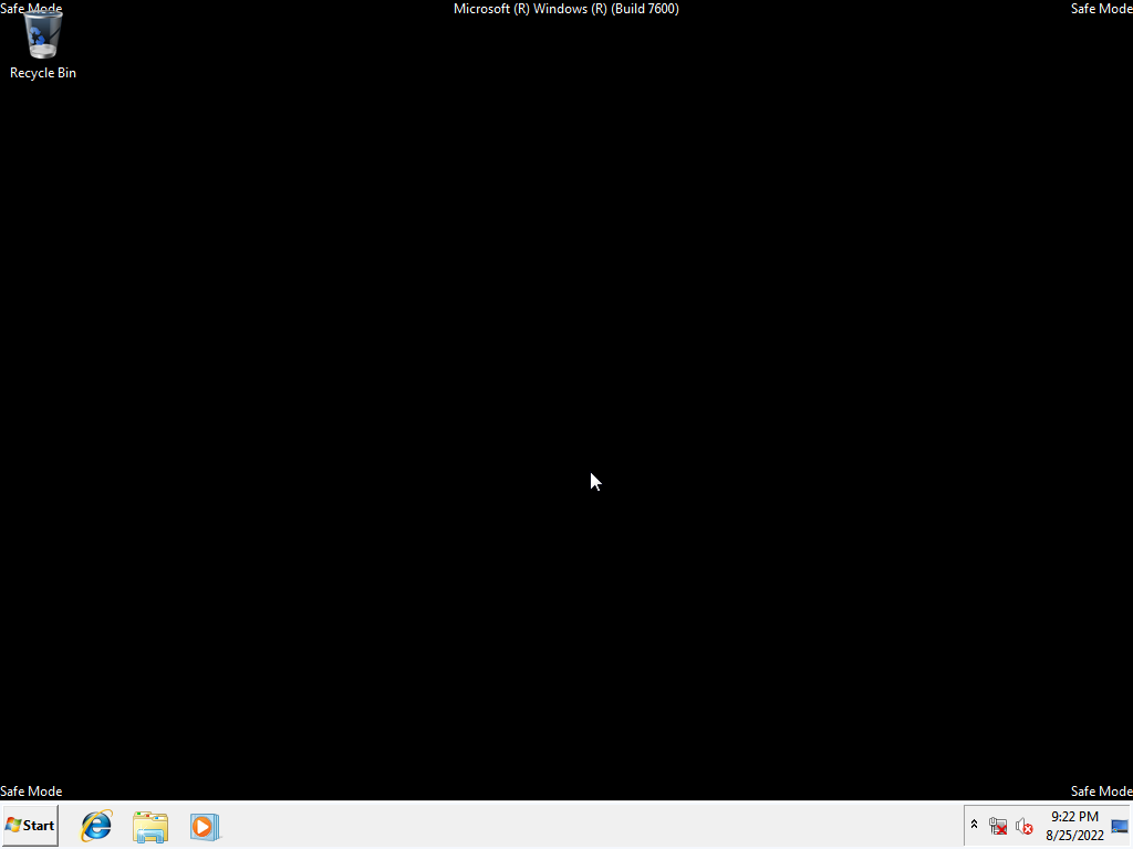
now we’re getting back into the era of Windows where the “Classic” theme still existed!
although Windows 7 is similar in style to Vista, Windows 7’s “glass” effects are more translucent than Vista’s. Windows 7 Starter and Home Basic editions did not support the full Aero theme with translucency - these editions were limited to the Basic style.
Windows 7’s taskbar is notable for introducing the ability to “pin” programs to the taskbar, and for grouping all of a program’s windows into a single icon on the taskbar. Windows 7 also adds the “Aero Peek” button (hides all windows to show your desktop) on the very end (right side) of the taskbar - although this can be disabled, it almost never is.
see also: Start button (Windows 7 vs. Windows Vista)
Windows Vista
|
|
|
| My Computer | Show Desktop |
|---|
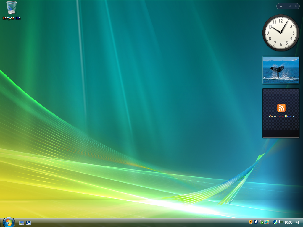
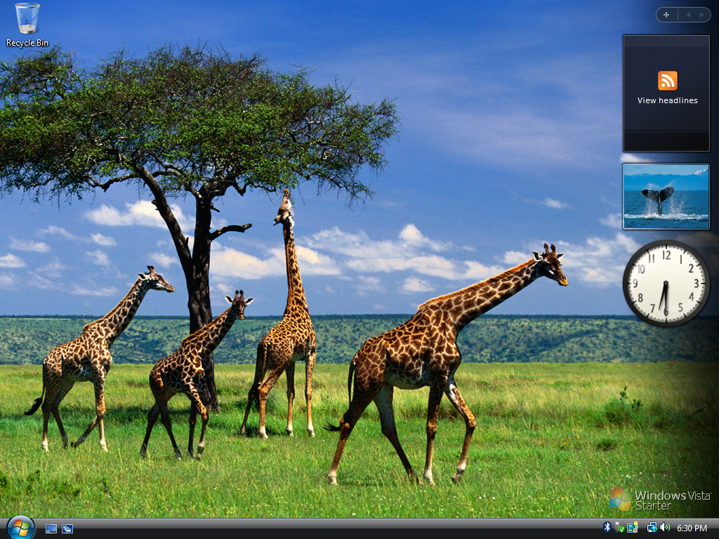
Windows Vista’s icons are - in general - a lot brighter than Windows 7’s, and far more “glossy” than Windows XP’s.
like with Windows 7, the lowest-tier editions (Starter and Home Basic) are limited to the Basic theme - no Aero.
see also: Start button (Windows 7 vs. Windows Vista)
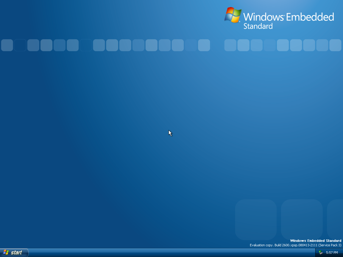
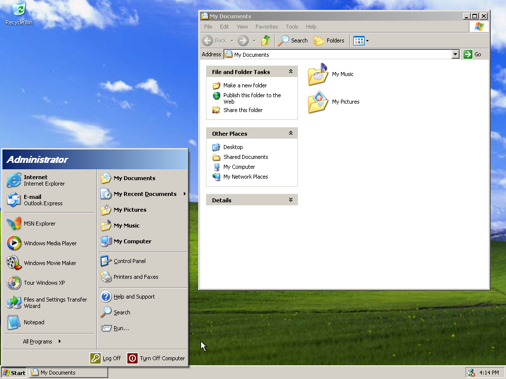
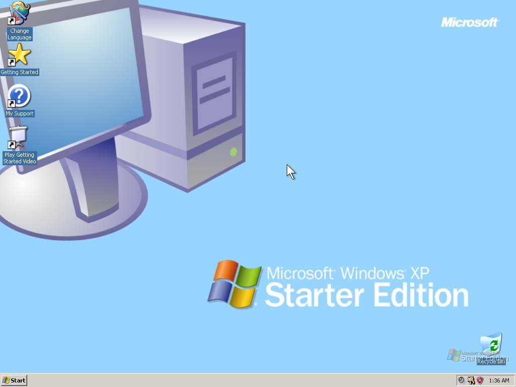
Windows XP
|
|
|
| My Computer | Show Desktop |
|---|
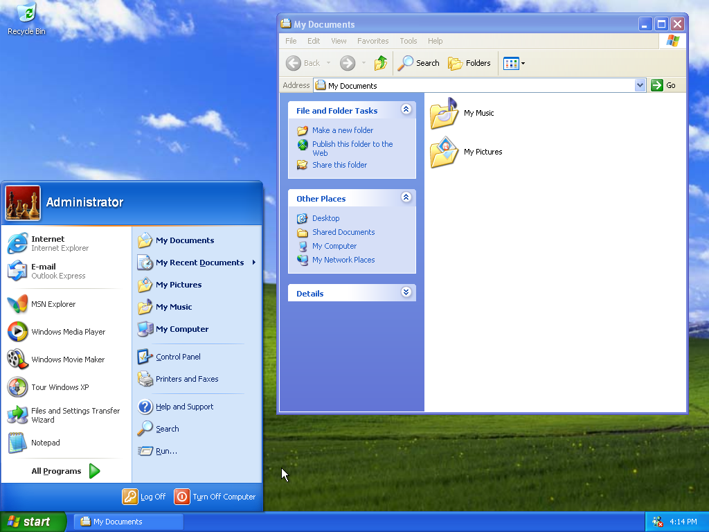
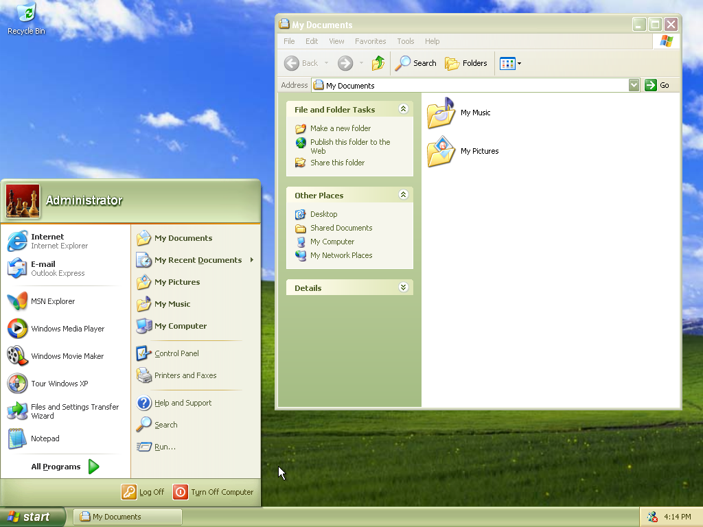
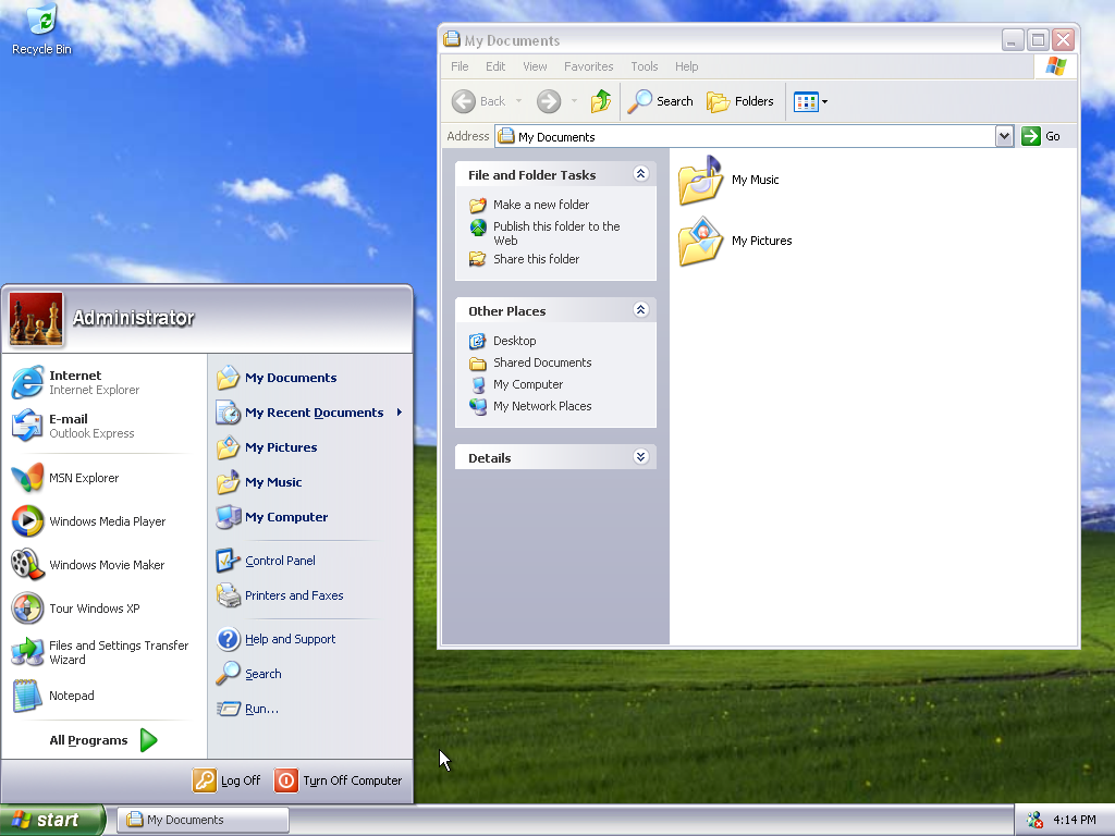
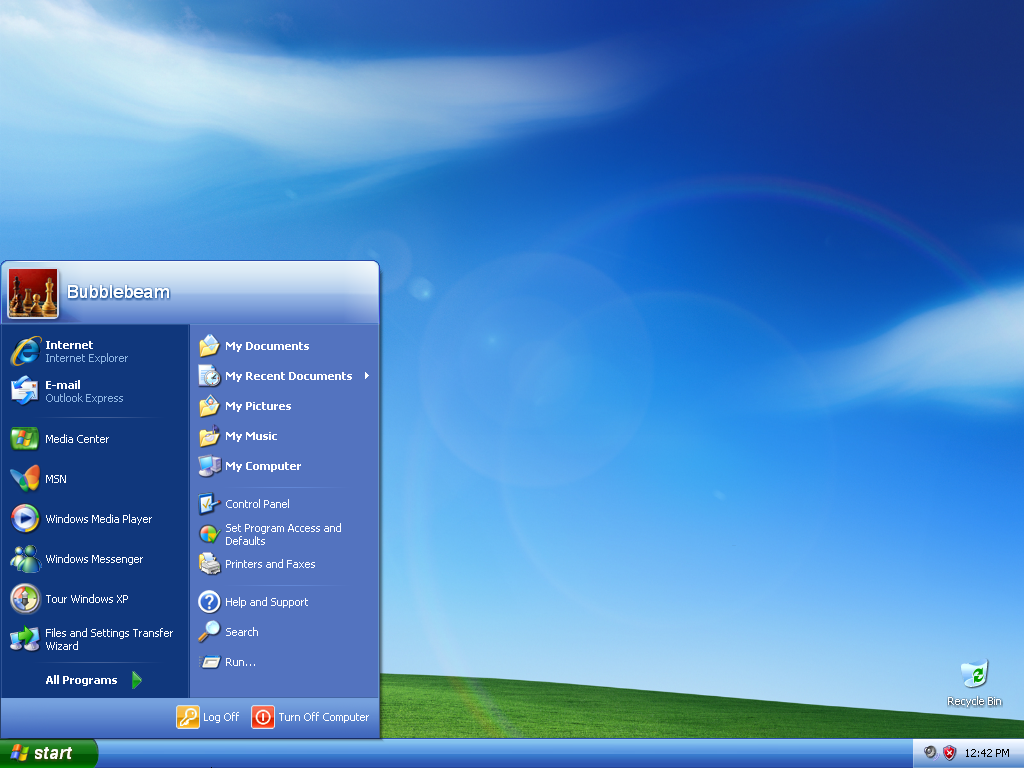
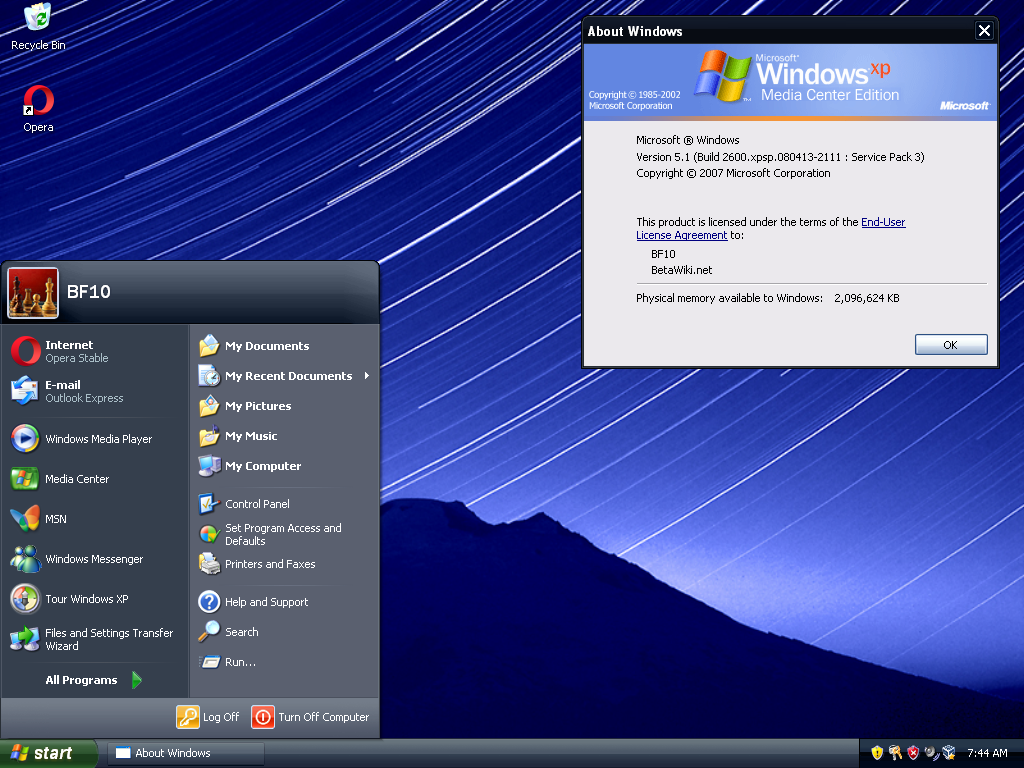
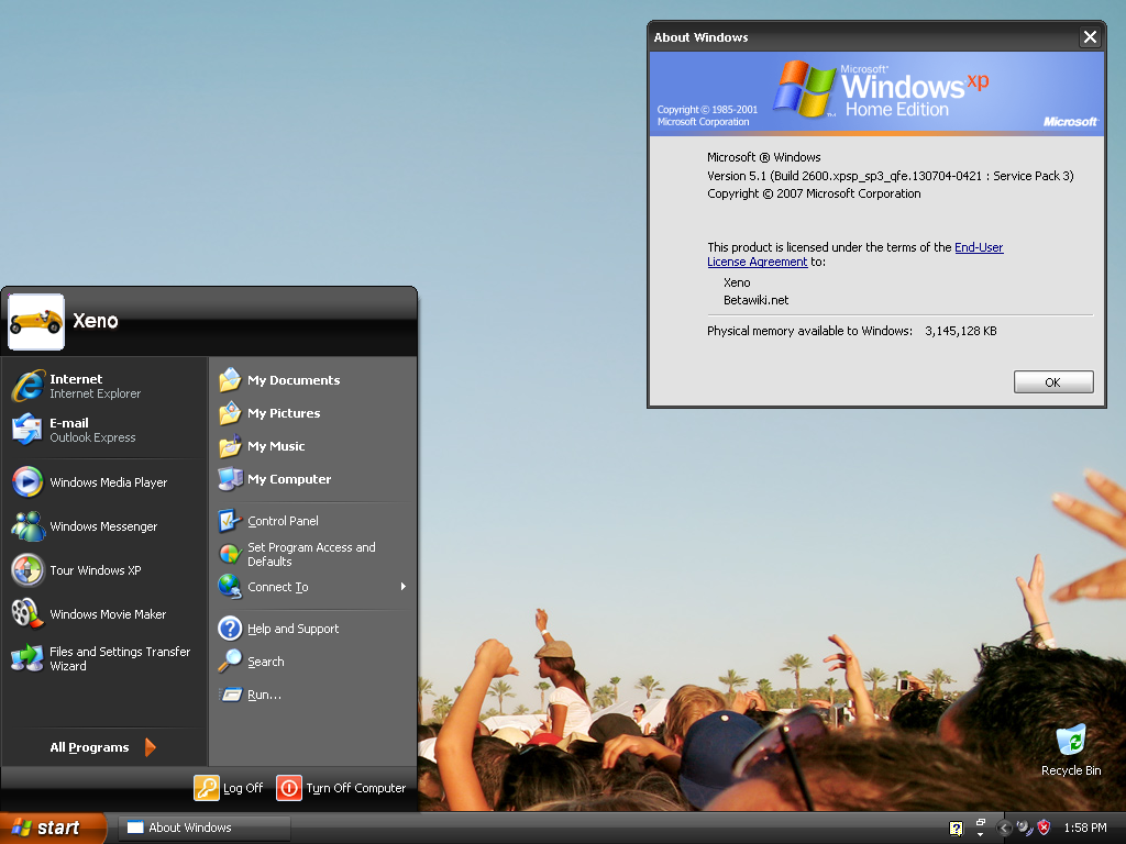
the golden age of Windows themeing. the Luna theme, which was blue by default, but also had “Olive Green” and “Silver” variants in the Home and Professional editions. other editions (Media Centre Edition being the prime example) shipped with an “exclusive” Royale theme - a variant of Luna, but far glossier. Royale could be copied onto normal Windows XP machines, and many people did this back in the day.
the defining characteristic for differentiating when looking at the Windows Classic theme - compared to earlier Windows versions - is that most of the icons have been re-designed. the Windows logo in the Start button, for instance, is easily distinguishable.
Windows 2000
|
|
|
| My Computer | Show Desktop |
|---|
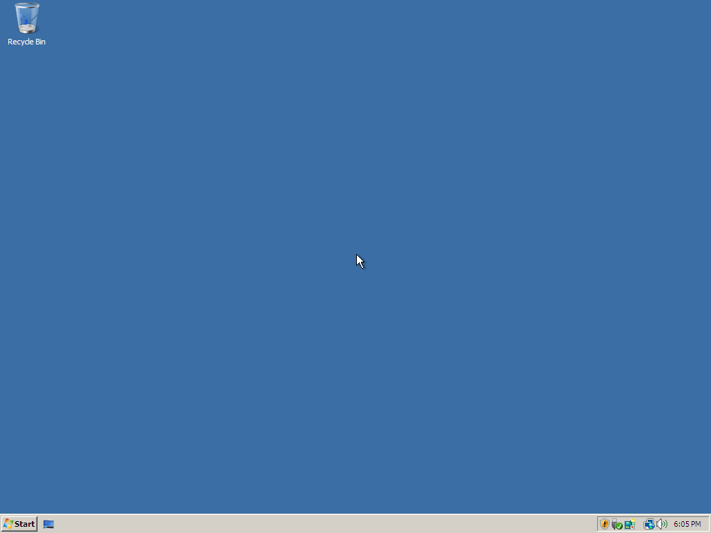
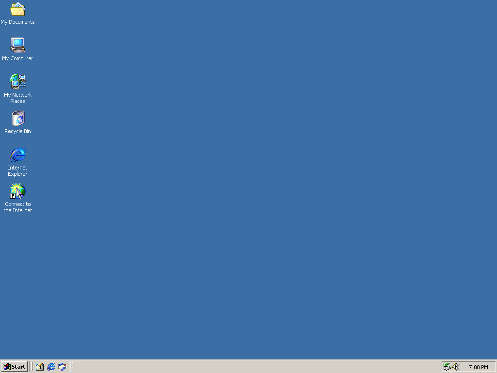
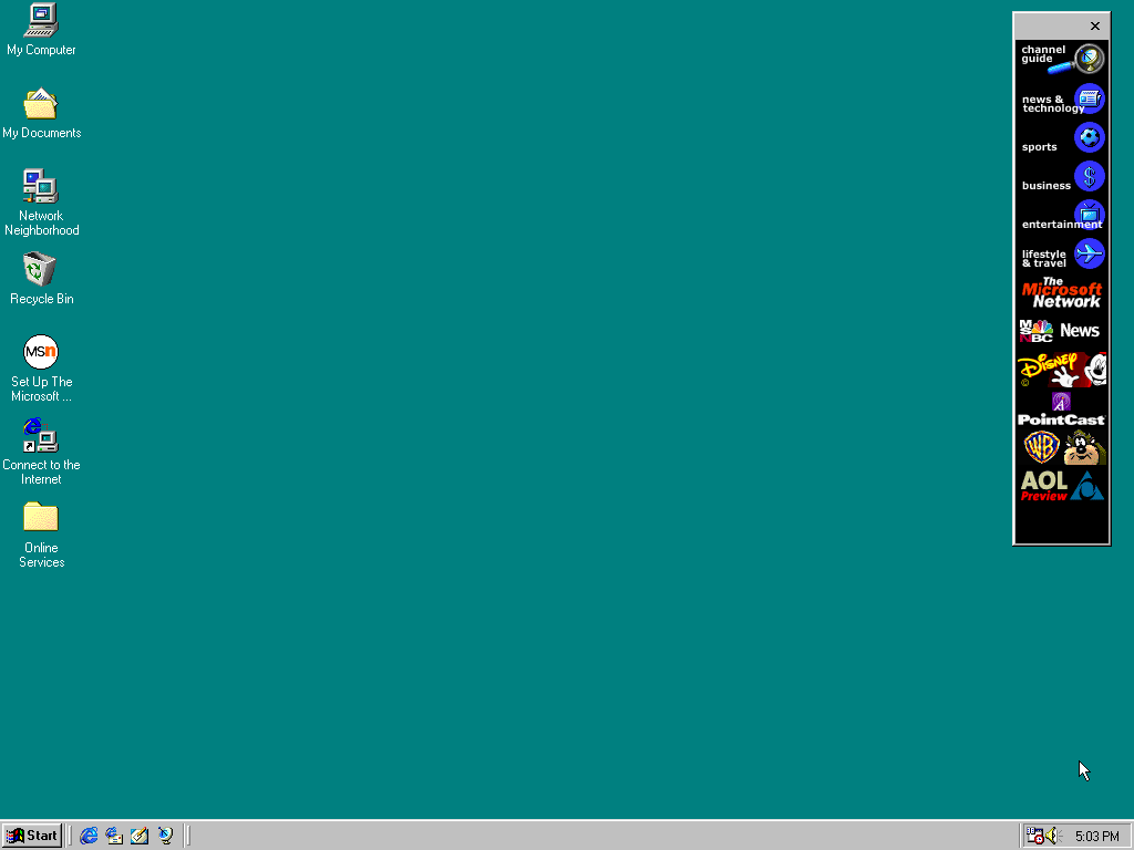
the classic Windows logo graces our taskbars!
the defining characteristic here, compared to older Windows versions, is the color scheme update. by default, Windows 2000’s taskbar is a significantly less “dull” shade.
Windows NT 4.0
|
|
|
| My Computer | Show Desktop |
|---|
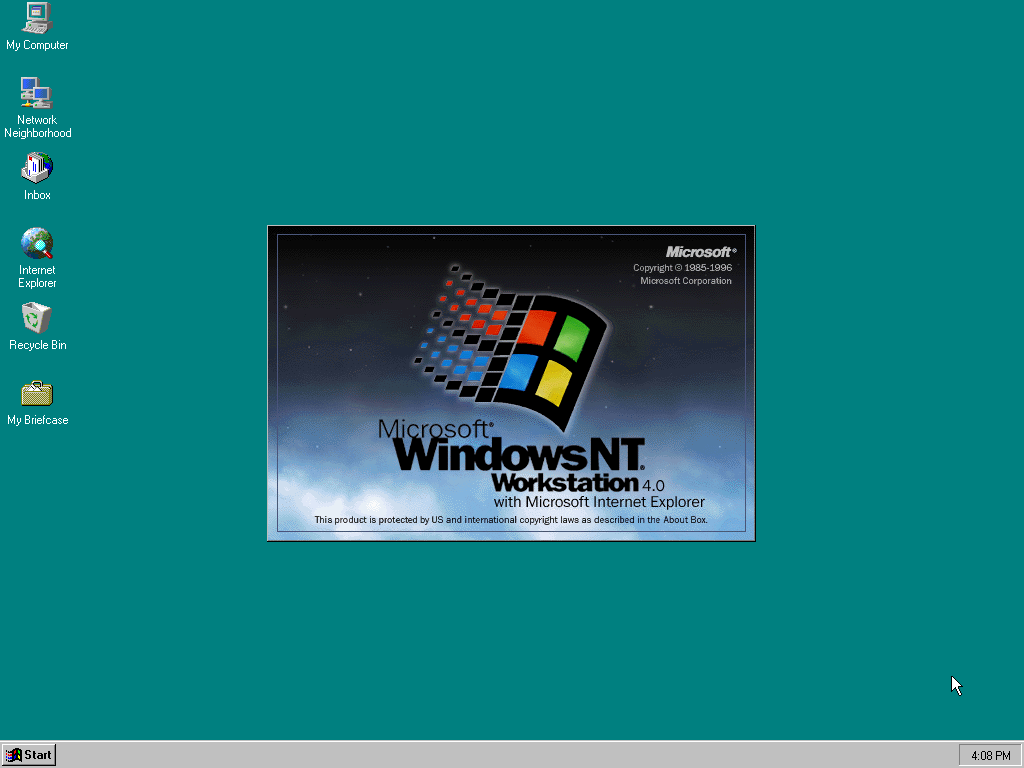
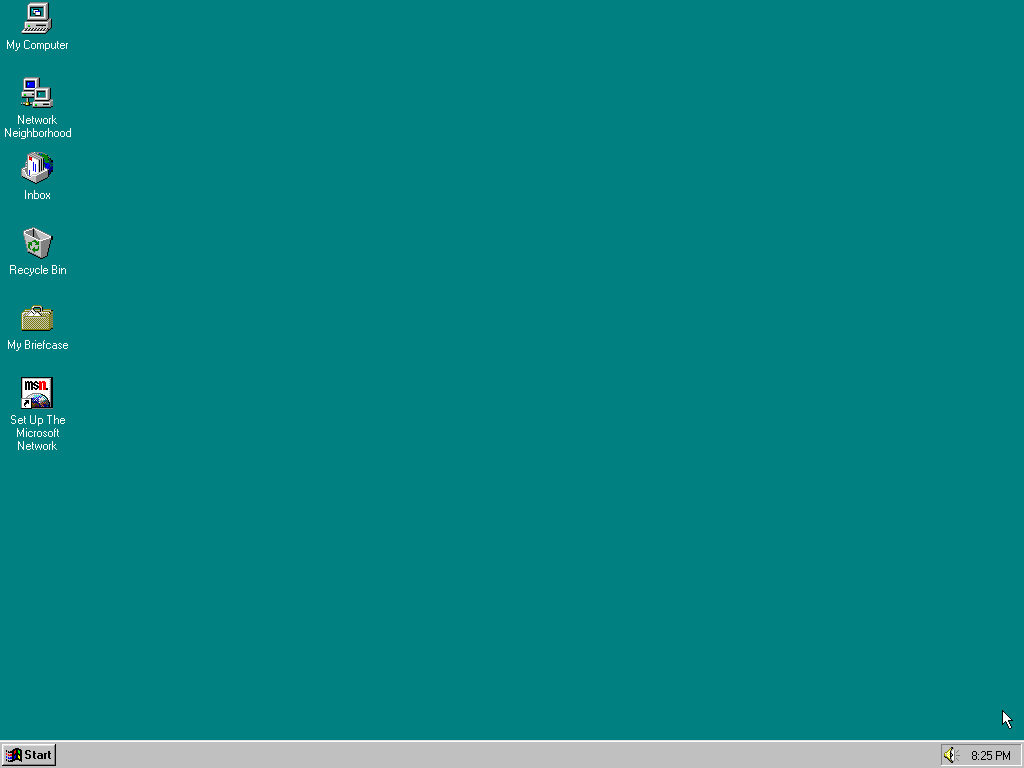
if it looks like Windows 98, but it doesn’t crash every 30 seconds, it’s probably Windows NT 4.
i’ll have to come back to this and figure out a better at-a-glance way to differentiate if the wallpaper isn’t set to the default one - expand the full screenshot just below and you’ll see what i mean…
Windows ME
|
|
|
| My Computer | Show Desktop |
|---|
Windows ME uses the icons & colour scheme as Windows 2000, but uses the same UI font as Windows 95 / 98.
Windows 98
|
|
|
| My Computer | Show Desktop |
|---|
Windows 95
|
|
|
| My Computer | Show Desktop |
|---|
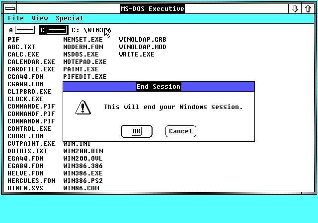
Windows NT 3.x / Windows 3.x
and this is now the pre-Windows Explorer era!
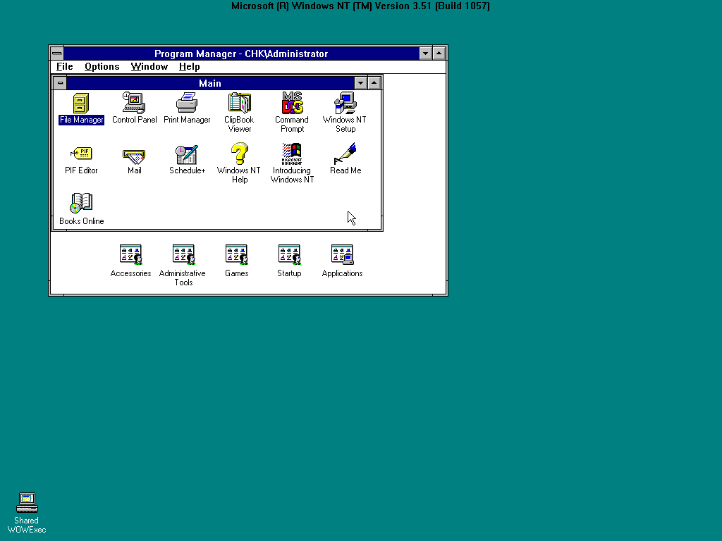
if you’re looking at a Program Manager screenshot, and it has a DOMAIN\username in the title bar, it’s Windows NT 3.x - otherwise, it’s Windows 3.
Windows 2.x (a.k.a. Windows/286 and Windows/386)
i don’t think i need to say anything here.
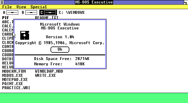
Windows 1.0
i really don’t think i need to say anything here.
comparisons
Start button (Windows 7 vs. Windows Vista)
the Start button orb extends past the edge of the taskbar by default in Vista, but it can also do this on Windows 7 (if the option to use small taskbar icons is turned on).
the “bloom” effect in the centre of the flag panels of the Windows logo is far more prominent on Vista than on 7 - especially so in the Classic theme’s Start button.
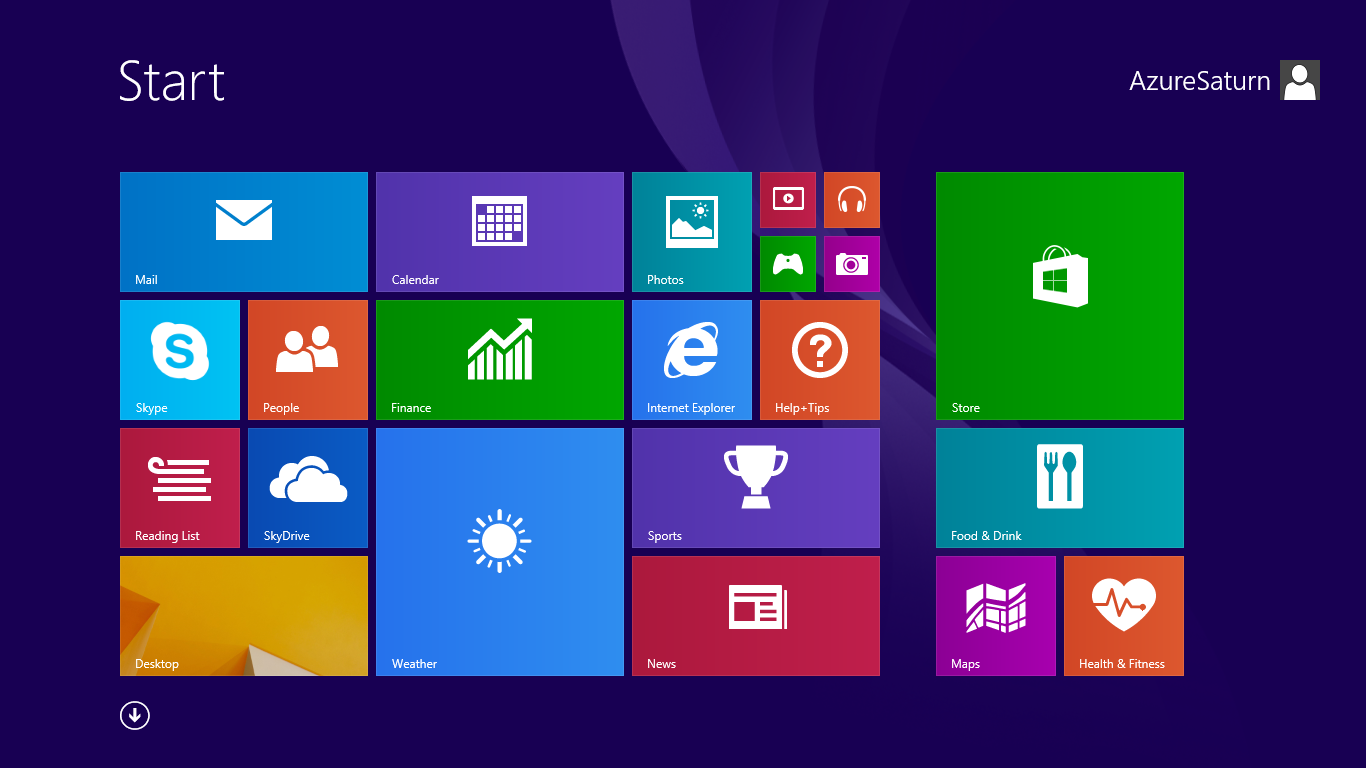
Start screen differences between Windows 8 and 8.1
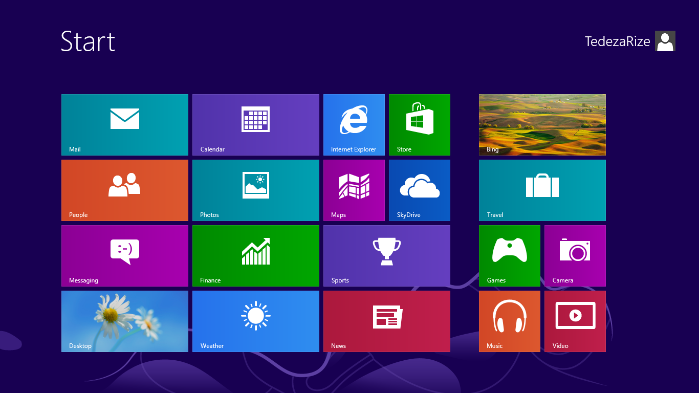
Windows 8’s “Metro” Start screen lacks the arrow icon at the bottom left (which is clickable to show the full app list) - this was added in Windows 8.1 (along with the Start button on the taskbar) to make things more mouse-friendly again.
| Windows 8 RTM | Windows 8.1 RTM |
|---|---|
|
|
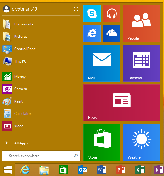
Bonus: Windows RT 8.1’s Start menu
The last update for Windows RT 8.1 added a real Start menu again! This was meant to be added to non-RT Windows 8.1 also, but the plans for that changed in favour of prioritising Windows 10… so Windows 8 never got a “normal” Start menu.
other miscellaneous differences
in no particular order:
- if there is a keyboard layout selector in the form of a blue square on the taskbar, look at the capitalisation
- if all the letters are capitalised (eg.
PL) it’s NT - if only the first letter is capitalised (eg.
Pl) it’s 9x
- if all the letters are capitalised (eg.
shoutouts
- a lot of the screenshots here came from BetaWiki.net, which is a fantastic resource
- a number of people on the fediverse brought up more points of differentiation than i’d written initally:

